VisionOS is too big
05 January 2024 ~ 3 min read ~ Technology, Innovation
When you pull on a modern headset running VisionOS or Meta’s Android variant you get to place arbitrary software applications floating around you in space. It’s a neat effect, and promises to liberate your software from the 15” laptop in front of you or the formerly spacious monitor on your desk. Apple’s swings wildly towards freedom and chaos, Meta’s is limited and safe.
Windowing Tools
Apple’s offering is out in front for flexibility today, you can spawn nigh-unlimited windows around you in space and drop them around and above you. Meta allows you three windows, all placed in a small, nearby plane or a large curved plane. Both systems leave these windows where you place them in your house. Both systems then allow you to re-center them which snaps them all back to being in front of you.
With all this freedom, Apple has one challenge that Meta doesn’t: you will occlude windows behind other windows. This happens constantly, just as it does in macOS or Windows, but there’s no Cmd-Tab equivalent to cycle through windows to foreground, nor an expose equivalent to temporarily arrange all windows beside one another to find the one behind the others. There’s also no Spotlight equivalent to quickly launch apps or search. This feels desperately needed.
You can use the Home screen to navigate between apps, however I feel like having to click the Digital Crown on the headset to call it up breaks flow by having to press on your face. There should be a slick gesture to summon that screen without having to touch the headset.
Window Sizes
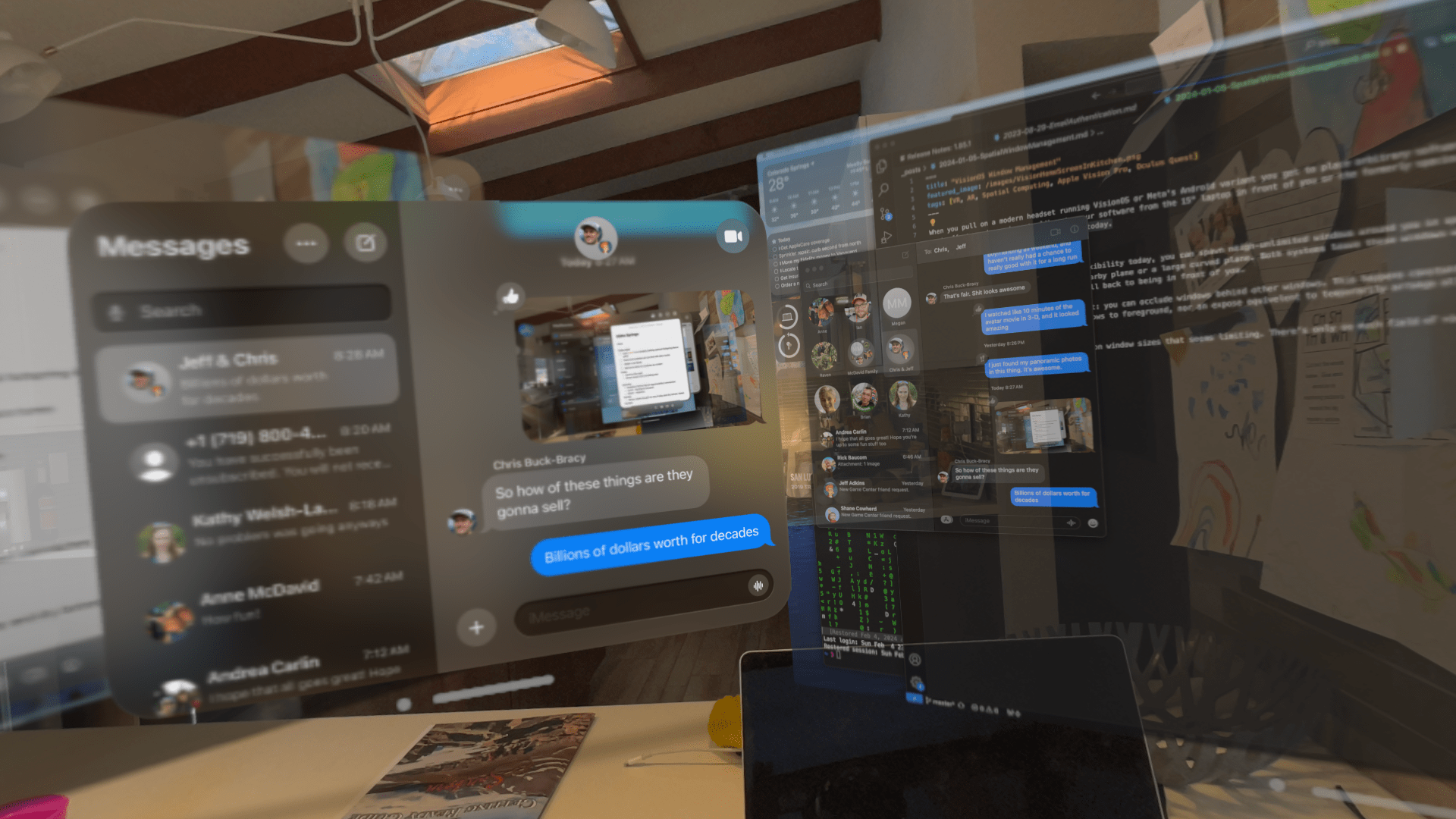
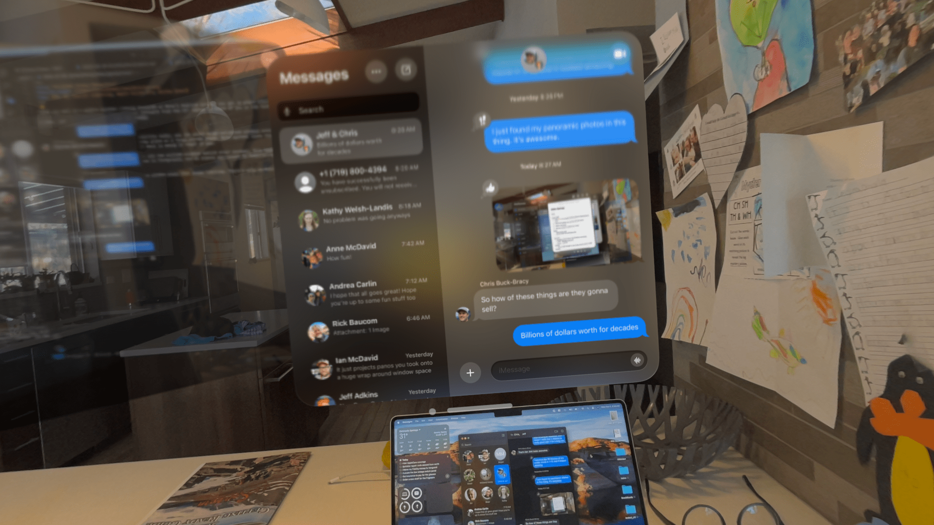
Apple’s software also has a lower bound on window sizes that seems limiting. There’s only so much field of view in there, and the effective maximum of simultaneous viewable windows in about two. VisionOS windows are much larger than their screen-bound equivalents.
 ]
]
You can see messages is roughly twice as tall in a VisionOS window as in its neighboring macOS equivalent projected into VisionOS. Compare that to how large it would be on the MacBook monitor below, roughly 8 times as large!
 ]
]
Compared to the legible little Messages on the laptop screen, we’re eating something like 15x the space.
Why tho
Information density creates cognitive load, so it’s sensible that for this first foray, Apple chose to start us with these oversized friendly windows so as to be unintimidating.
Maybe it’s about click targets needing to be chonky? VisionOS would be significantly better if I could jam more info in the view in front of me before I’m turning my head comical amounts.
All things in time
These are day-one software quibbles on a platform that’s utterly rich with promise. WWDC24 is four months away. Apple has the strongest general purpose operating system and developer story for any headset today. I like that this will likely kick Meta in the pants to think bigger about the importance of the UX of the OS itself, which will in turn prod Apple to go further too.